Work / Midwestern Interactive
Bringing AI into how an agency designs
Leading design at Midwestern Interactive: one design standard, AI tools the whole agency builds with, AI-ready design systems for clients like GiveCampus and MatchED, and Vision Pro design for Fidelity's Plynk.
- Role
- Product Design Team Lead
- Team
- 3 full-time designers + 5 contractors
- Timeline
- 2025–
- Status
- In progress
- Scope
- AI toolingAgency-wide adoptionDesign systemsFirst design engineerFirst spatial UX designer

- Client decks, with AI tools built on the system
- Days → hours
- AI tools used by design, sales, PMs, and leadership
- Agency-wide
- To launch a full client design system
- < 3 mo
- Designers led: 3 full-time, 5 contractors
- 8
Context
Midwestern Interactive designs and builds digital products for clients across industries. As AI changed how software gets made, the question for an agency became practical: how do we deliver better work, faster, without lowering the bar on craft? And what should a designer at an agency be able to do now?
I joined in August 2025 as Product Design Team Lead, leading a fully remote design team of 3 full-time designers and 5 contractors, while still delivering for clients myself. I'm also Midwestern's first design engineer and its first spatial UX designer.
The hard call: one standard
When I arrived, every deck and most deliverables were built by hand, and every designer, contractor, and team did it a little differently. Quality depended on who was staffed. I pushed for one standard: a single design system and a single slide library that everything is built from, including the AI tools.
Standardizing first is what made AI useful. An AI tool can only produce on-brand work if there's a system that defines what on-brand means.
AI tools built on the system
I built two AI tools on top of Midwestern's design system:
- Slide deck builder. It builds presentations directly from the Midwestern Slide Library and design system in Figma, using real published components rather than lookalikes.
- Brand application. It applies Midwestern's brand standards to anything client-facing: proposals, one-pagers, case studies, and documents.
They're used across the whole agency, not just by design: the design team, sales and business development, PMs and account leads, and leadership. Anyone at Midwestern can now produce on-brand work without waiting on a designer. Client decks that used to take days now take hours.
How I lead
- Rolling AI out to the team. Bringing AI into how we design, prototype, and hand off, with clear guardrails, and then out to the rest of the agency through the tools above.
- Leading a blended team. Weekly critiques and team meetings keep full-time designers and contractors on one set of standards and one system, so client quality doesn't depend on who's staffed.
- Defining the design engineer role. As the first design engineer at Midwestern, I'm building the foundations for what the role is: the skills, the process, and where it fits on client teams.
- Opening up spatial UX. As Midwestern's first spatial UX designer, I designed Apple Vision Pro for Plynk, Fidelity's investing app, and built a spatial design system for it: components, depth, materials, and interaction patterns for a medium with no established playbook.
- Three ways to engage. Design systems, feature delivery, and fully embedded designers, so each client gets the model that fits.
Midwestern's own design system
Midwestern's design system is the foundation for everything above. It keeps a blended team consistent, gives every client engagement a head start instead of a blank file, and gives the AI tools a definition of "on-brand" to build from.

- What's in it: foundations (color, typography, spacing, grid, elevation, icons, and variables), components (buttons, form fields, checkboxes, radios, search, tags, tooltips, cards, header, and footer), and an illustration system, each with its own documentation page.
- Who uses it: designers, engineers, marketing, and the AI tools, all from the same source.
- How it's governed: every foundation and component is tracked in one inventory with a status, from in progress to ready for development to stable.
- What changed: faster kickoffs, fewer rounds of revisions, and more consistent output across the team.
Inside the system
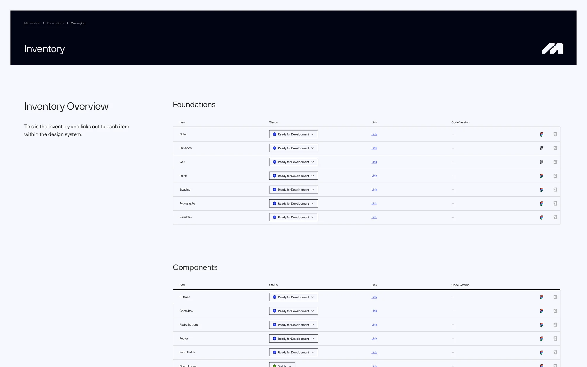
01One inventory for everything in the system, each item with a status and a link to its documentation.
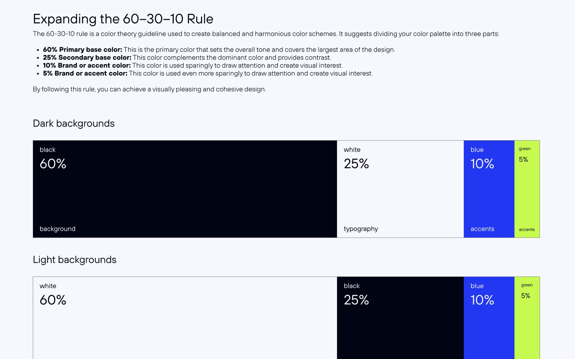
02Color as a rule, not just a palette: a 60/25/10/5 split for dark and light backgrounds.
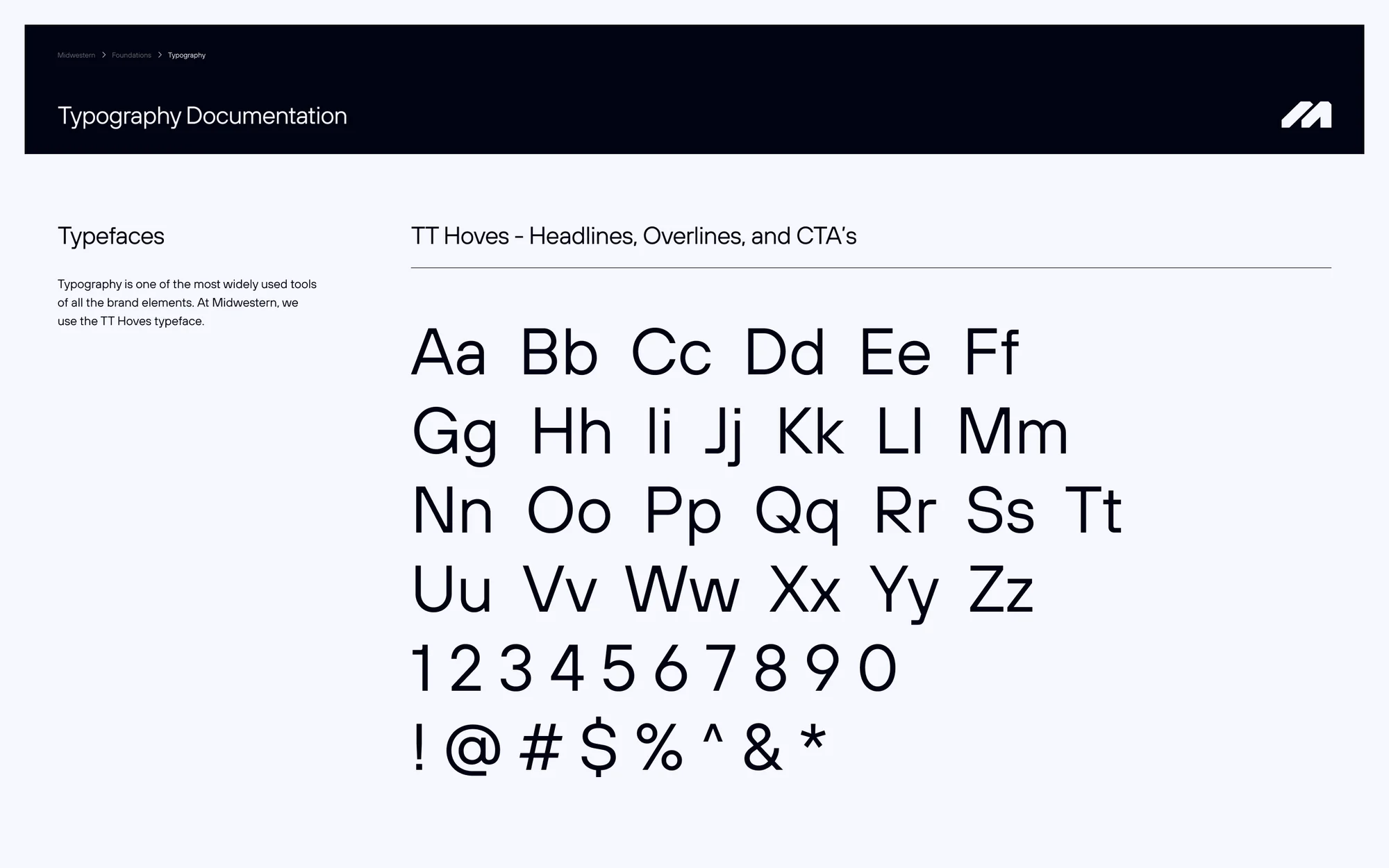
03One typeface family, TT Hoves, with a documented hierarchy from overline to CTA.
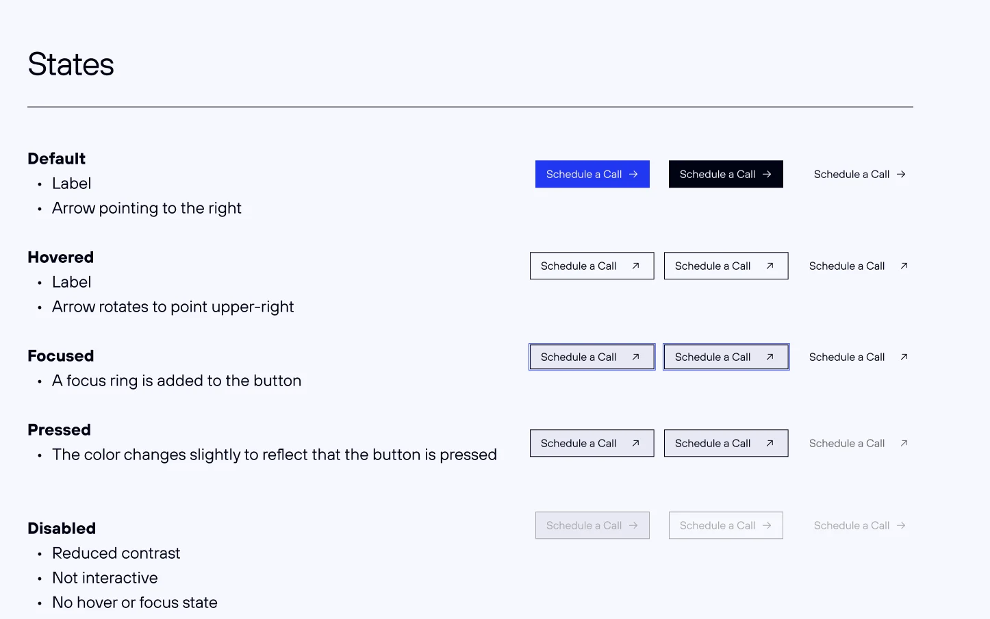
04Every component documents its anatomy, states, variants, and usage rules.
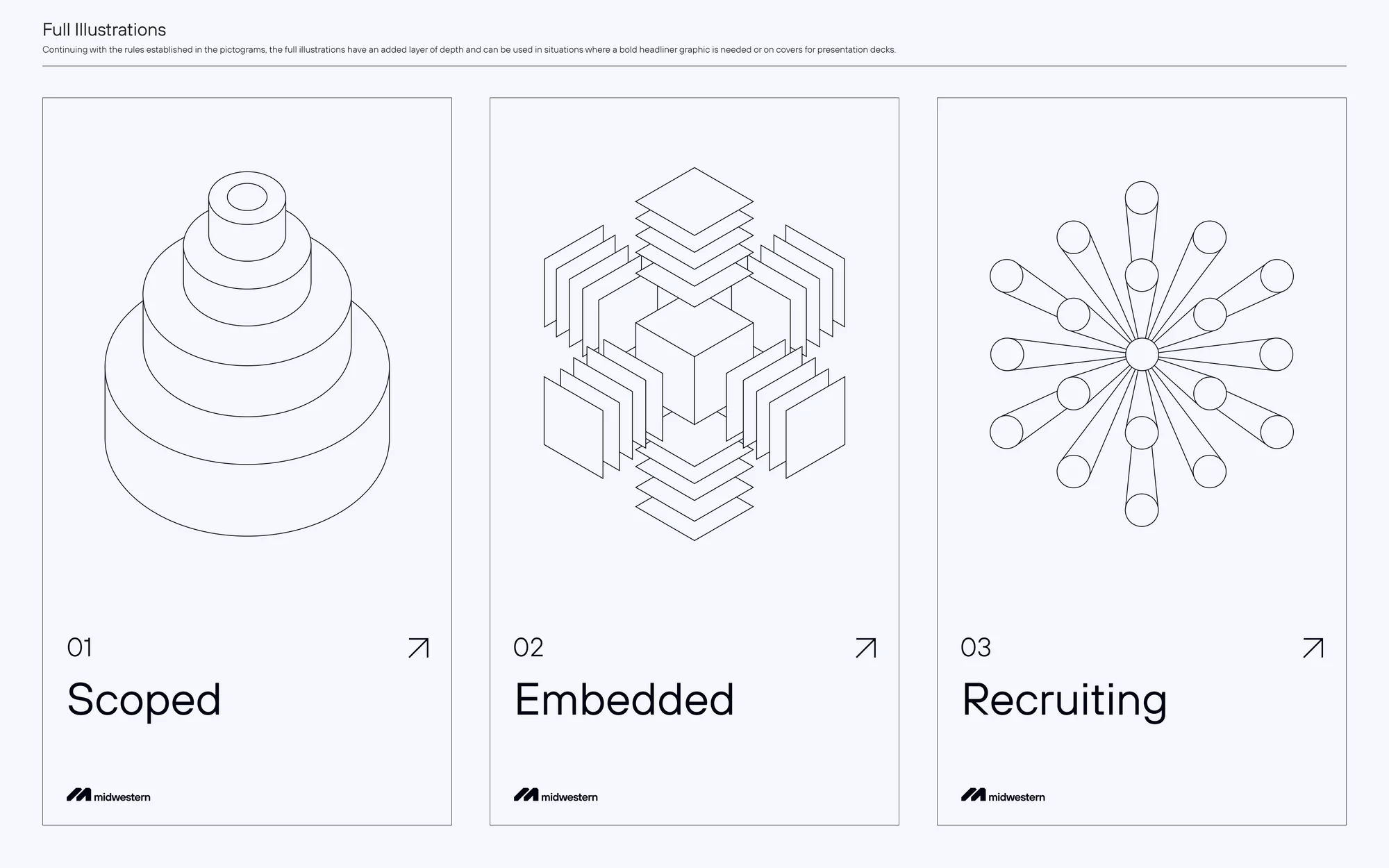
05An illustration system for the three ways Midwestern engages: scoped, embedded, and recruiting.
Spatial: Plynk on Apple Vision Pro
Plynk is Fidelity's investing app for a new generation of investors. I designed its Apple Vision Pro experience, Midwestern's first spatial product, where market data stops being a list on a screen and becomes something you can walk around.
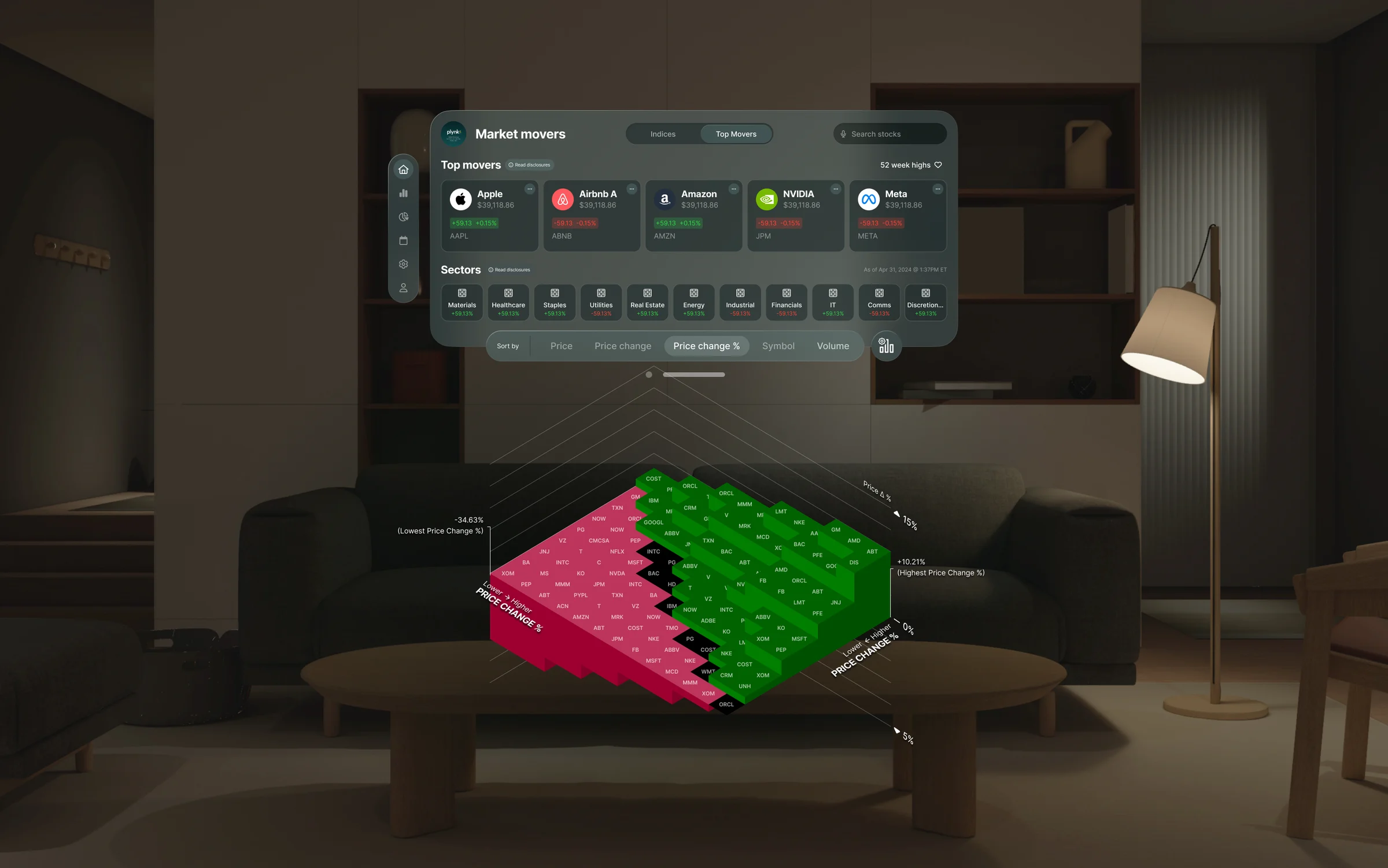
- A spatial design system. Glass panels, a shared tab bar and toolbar, cards, and controls, built once and reused across every window: market movers, portfolio, calendar, settings, and disclosures.
- Depth with a job. Data only leaves the window when depth adds meaning, like the heat map, so the experience never turns into a tech demo.
- Designed for the medium. Gaze, dwell, and window placement were explored and reviewed in rounds before anything was finalized.
Plynk XR
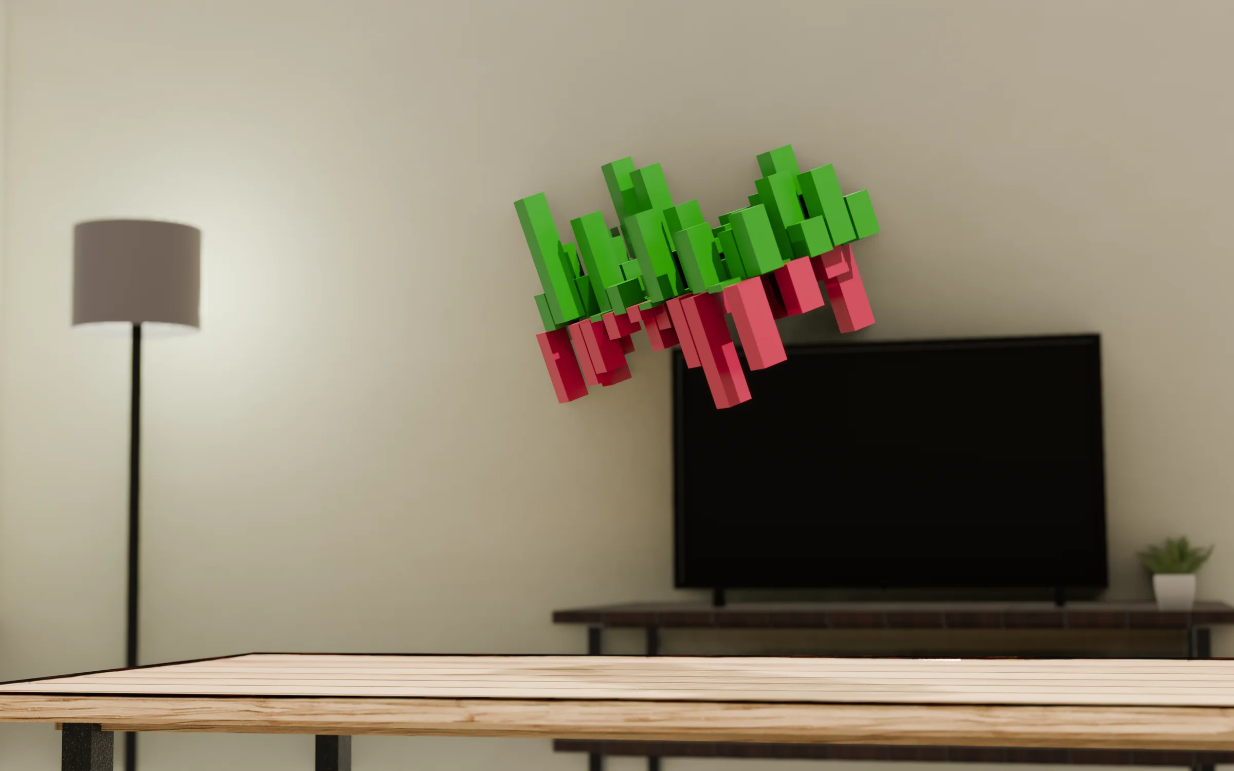
01Early concept render: market moves as physical objects in the room.
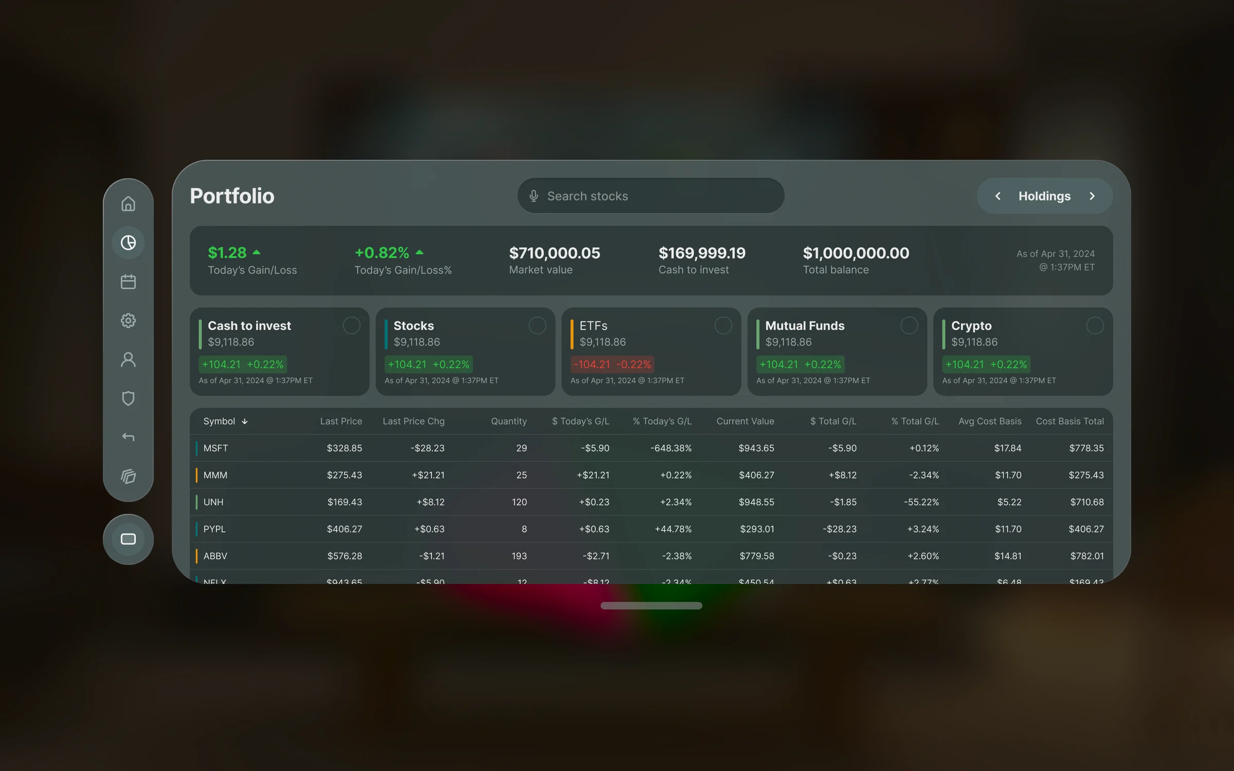
02Portfolio: the whole picture at a glance, with holdings one look away.
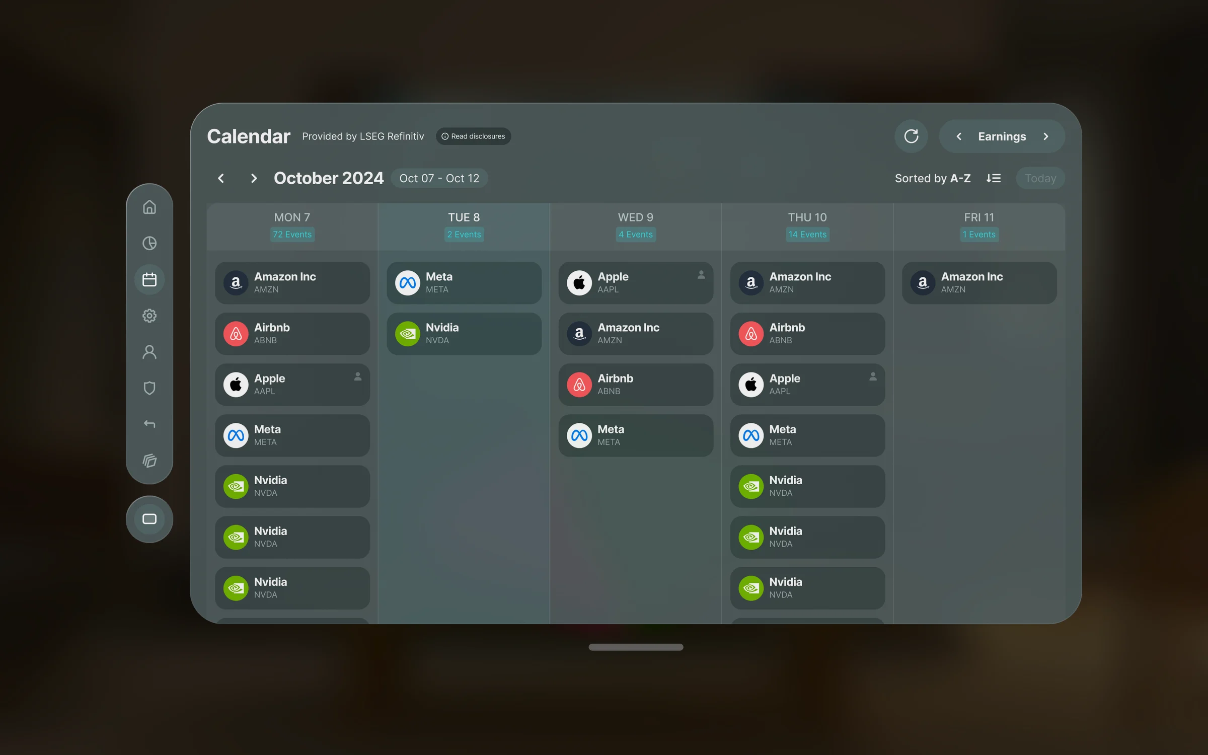
03An earnings calendar built from the same panel, tab bar, and card components.
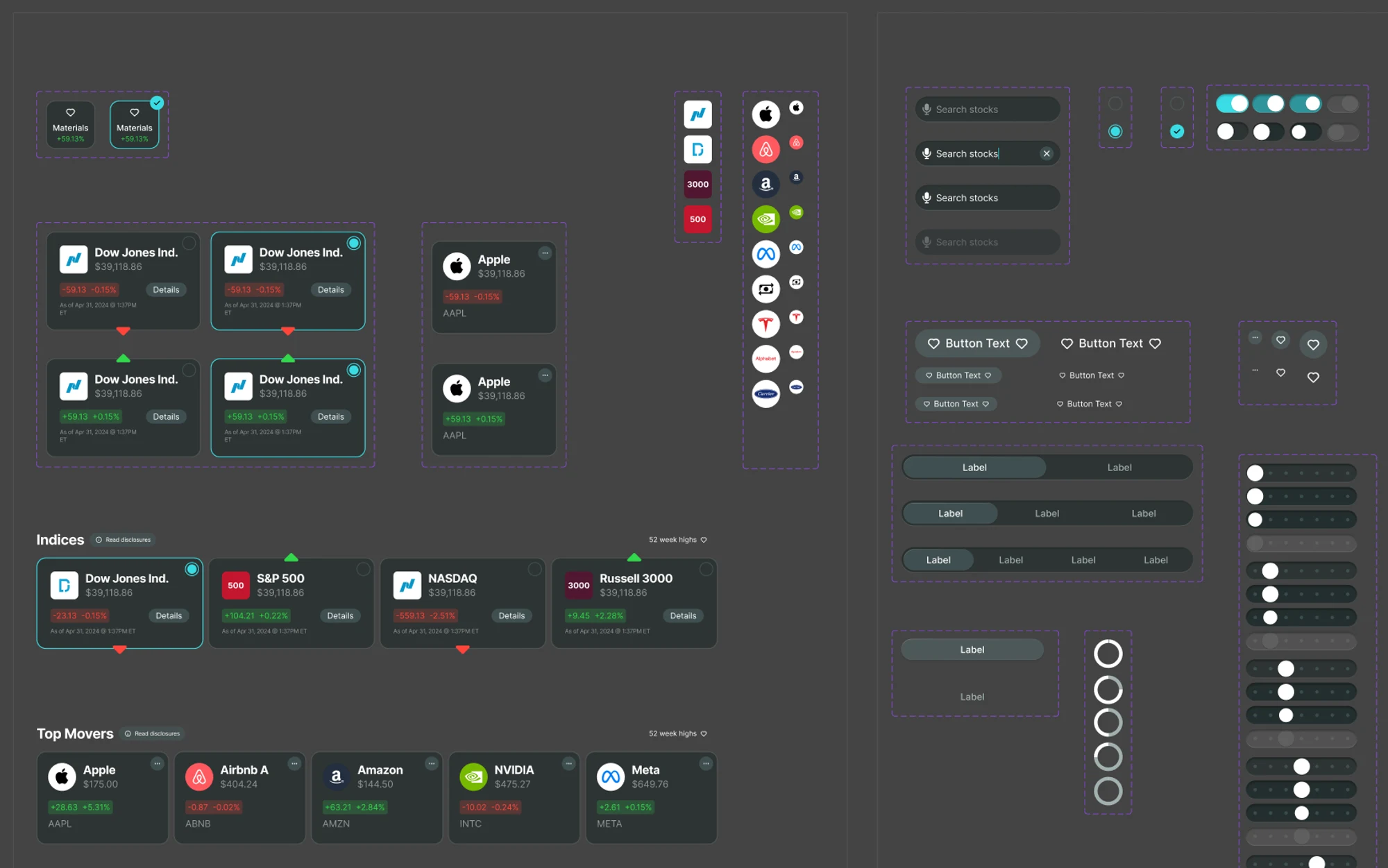
04Part of the spatial component library behind every window.
Design → code with AI: GiveCampus
GiveCampus, a Midwestern client, powers fundraising for schools and universities. As the design engineer on a team of four, I worked across the whole system: tokens, components, documentation, and the tooling that connects Figma to code.
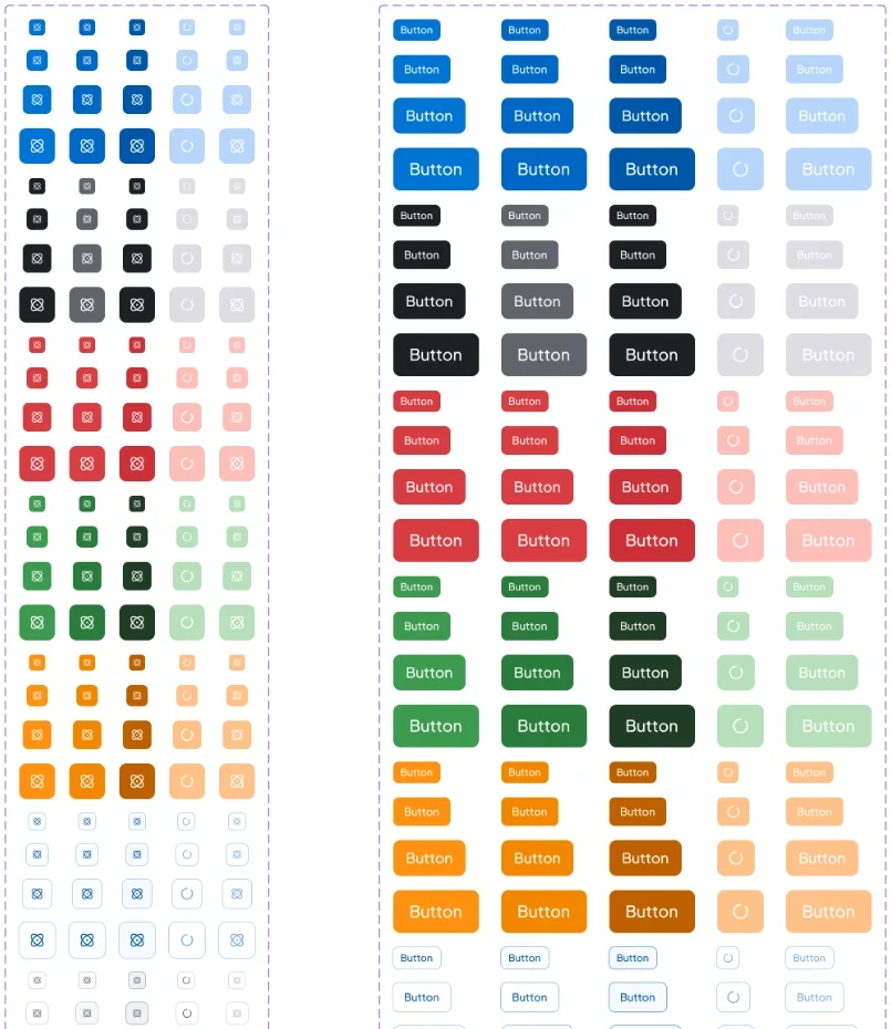
- A token-first foundation with color, type, space, and motion defined once and shared between Figma and code.
- Components built for AI. Structured and documented so AI coding tools can use the system correctly, not just people.
- An AI-assisted workflow from design to production.
Parity is tracked component by component. A component only counts as done when the Figma version and the coded version are reviewed side by side and signed off as matching.
Design ↔ code parity · 78 components and foundations
As of September 2026
48
Aligned
6
In review
24
Not yet
Data display 12
Data entry 23
Feedback 7
Layout 4
Navigation 6
Other 2
Foundations 1
In Figma, not yet in code 14
Tokens 9
Client product: MatchED 2.0
MatchED connects families, educators, and schools. Version 2.0 matches each learner with curricula, tutors, and programs, and adds personalized learning pathways, local co-op communities, reviews, a shared family calendar, and a resource marketplace.
I led design across the whole 2.0 product and built its design system, which is now live as an early release.
Measuring adoption honestly
A design system only matters if teams actually use it, so I measure adoption in production code, not in Figma. On one client's production app, we launched a full design system in under three months, and I set up a baseline that holds up to scrutiny:
- One denominator: every rendered UI instance across the front end (about 18,000), each counted in exactly one bucket: design system, an in-repo kit, hand-written HTML, or legacy Rails templates.
- Accountable by team: every instance is attributed to one of six product teams through code ownership, so adoption is something each team owns.
- Reproducible: every figure is pinned to a specific commit, and when the method changes, the report restates its own history instead of quietly moving the numbers.
How the front end is built, Feb 2025 → today
- Design system
- In-repo kit
- Raw HTML in React
- Rails templates
View as table
| Month | Design system | In-repo kit | Raw HTML in React | Rails templates |
|---|---|---|---|---|
| Feb 2025 | 0.0% | 0.0% | 11.8% | 88.2% |
| Mar 2025 | 0.0% | 0.0% | 11.8% | 88.2% |
| Apr 2025 | 0.0% | 0.0% | 12.5% | 87.5% |
| May 2025 | 0.0% | 0.0% | 13.3% | 86.7% |
| Jun 2025 | 0.0% | 8.6% | 15.6% | 75.8% |
| Jul 2025 | 0.0% | 11.5% | 16.3% | 72.2% |
| Aug 2025 | 0.0% | 13.8% | 17.1% | 69.1% |
| Sep 2025 | 0.0% | 15.6% | 17.4% | 67.0% |
| Oct 2025 | 0.0% | 16.7% | 17.8% | 65.5% |
| Nov 2025 | 0.0% | 18.9% | 18.1% | 63.0% |
| Dec 2025 | 0.0% | 20.4% | 18.6% | 61.0% |
| Jan 2026 | 0.0% | 22.3% | 19.0% | 58.7% |
| Feb 2026 | 0.0% | 23.4% | 19.3% | 57.3% |
| Mar 2026 | 0.0% | 23.8% | 19.3% | 56.9% |
| Apr 2026 | 0.0% | 25.7% | 20.1% | 54.2% |
| May 2026 | 2.3% | 25.7% | 20.4% | 51.6% |
| Jun 2026 | 9.4% | 22.5% | 20.2% | 47.9% |
| Jul 2026 | 11.2% | 22.1% | 20.6% | 46.1% |
| Aug 2026 | 15.4% | 20.7% | 21.4% | 42.5% |
| Sep 2026 | 17.5% | 20.6% | 21.8% | 40.1% |
The useful finding wasn't the growth. Most of the shift away from legacy code went to an ad-hoc component kit and hand-written HTML, not the design system. In the latest two weeks, 76.9% of net-new UI still wasn't on the system. So the client's Design System Committee set a clear target: get that number as close to zero as possible by the end of October. Measuring honestly is what made that conversation possible.
Outcome
- Agency-wide AI tools: design, sales, PMs, and leadership produce on-brand work without waiting on design.
- Client decks in hours, not days.
- A full design system launched in under three months, growing from zero to 17.6% of a production app's UI in under six months, measured commit by commit.
- MatchED 2.0 shipped as an early release, with its own design system.
- Firsts at Midwestern: first design engineer and first spatial UX designer, including a spatial design system for Plynk on Apple Vision Pro.
Reflection
AI lets us build faster, but speed isn't the point. AI scales the impact of design: when the system is the source of truth, anyone in the company can produce work that meets the bar, and designers spend their time raising the bar instead of reproducing it.
That changes what a design team is for. Less of the job is making every artifact; more of it is building and governing the systems everything else is made from.
Next case study
Building design at AutoNation, from 0→1 to AI →